In Australia, Coke is launching a 250mL coke can with a big hullaballoo. Spin it all you want, but this is an admission the industry is in giant trouble.
The normal procedure for shrinking portion sizes is to be damn sneaky about it. Toilet paper companies shrink the number of squares per roll, chocolate bar companies shrink the grams per Snickers, detergent companies shrink the bottles and put the words “ultra concentrate” on the front.
But Coke is upfront.
““The 250ml pack size provides Australians with a perfect serve of their favourite beverage from the COCA-COLA range. Priced at a maximum of $2, the 250ml can is expected to be popular with consumers,” said Antoinette Tyrrell, Marketing Manager COCA-COLA South Pacific.
After decades of watching Pepsi stalking them, Coca Cola got hit by a different sort of market change. Functional drinks have slashed the market share of soft drink. Energy drinks, sports drinks, juices, water etc. are all in the space. Coke has bought and built these brands up when it could, but when consumers are not choosing cola, Coke can’t ever hope to control the market like it did once.
The rise of functional drinks means people are thinking about what their drinks will do to them. That can never help Coke.
Aware of the perception that Coke is not that good for you, Coke manages it by giving you less!
They don’t even pretend to hope people will buy more of the smaller cans. They just hope people will buy them at all.
The last great marketing campaign Coke had was “share a coke with“. Now that was brilliant, completely. But its link with the underlying product is very weak, and it can’t overcome the long-run trend.
The global soft drink market is growing far more slowly than global economic growth (2 per cent vs 5 per cent) Coca Cola’s reported net revenues are down 3 per cent in the year to date, and Australia’s Coca Cola Amatil is a shambles. The share price has fallen from $15 to $9.
The end of Cola is a good thing. Much of Coca Cola’s revenue growth now come from the poorer parts of the world. But the model is there for them to follow – when they grow rich they will likely also no longer “Enjoy” Coke.
There are lessons in Australia’s history we can learn from. One of them is the screw-up that is Sydney.
Sydney was well-placed to become the London of Australia. A prime location, settled first, the early seat of power. It had it all. But while London remains by far the wealthiest and biggest city in the UK, Sydney is on-track to be overtaken by Melbourne in population.
If Melbourne overtakes Sydney, it won’t be the first time. Sydney had a 40-year headstart and yet lost its lead in the 19th century. At that stage the reason was the Gold Rush. Sydney got its lead back when a financial crisis hit in the 1890s.
Sources: various, but consider this a rough approximation.
If Sydney is overtaken by Melbourne in population, you can’t blame the Sydney-siders. They work hard, but they’re behind the eight-ball. The problem is the harbour.
If you think of it as public space, it’s lovely to look at and nice to use. But if you think of it as distance, is it smart to put so much of it right in the middle of your city? Do you really want so much distance between inner-city suburbs? Wouldn’t it be better to have a network of streets?
I contend that the harbour creates a massive problem in the middle of Sydney. The CBD is unable to connect properly into adjacent suburbs because they are a ferry-ride away.
Sydney has more than one major business cluster. The city competes with North Sydney and Parramatta.
But I’d argue that’s a sign of weakness, not of strength. Of course every city has suburban centres, but powerhouses like New York and London aren’t confused about where might be the centre of power, or the best spot to locate a business. Sydney’s situation whispers: this city is too big to really be one functional city. But globally-speaking, Sydney is not even that big, population wise.
So, the harbour in the middle could be part of the problem. But the harbour became the centre of Sydney only when a bridge was built that made the north shore more accessible. You can see the population develop in this video and the north only really takes off after 1932, when the final rivet was painted.
The smart move would have been to densely fill in the area to the south, intensively, before building to the north.
We’ve all played computer games where you have to build certain things in a certain order. If you build too many of the wrong thing too early, you get out of whack, run out of gold and you can’t beat the game. I’d argue that’s what Sydney did.
The Bridge was built using £6.25 million of public money. That represented about 2 per cent of NSW’s GDP at the time. For comparison, 2 per cent of GDP now would be about $10 billion. (sources: 1, 2)
Despite using tolls to pay it off, the debt lingered until 1988.
The opportunity cost? Not just the proper development of contiguous land areas, but also what that money might have bought if spent differently. When the rest of the world was building world class public transport systems, Sydney let theirs go.
If Sydney didn’t build the bridge, the city might have simply left the harbour as a boundary on the north. Of course some people would have chosen to live there still, but probably fewer. There’s plenty of space to the south that could have become very desirable had the economic centre of the city not been shifted north by the “coat-hanger”.
London has lots of bridges but the wealth and the productivity is overwhelmingly on one side of the Thames. It required Manhattan house prices to reach many millions before Brooklyn got any buzz, and Shanghai only developed the far side of the Huangpu in the last 20 years.
I’d be very interested to see a meta-analysis of whether, in the last 50 years, the value of having a river has turned from positive to negative in terms of a city’s economic growth. The impediments a big river would create to city connectivity are likely to be significant, especially where bridges are in short supply.
All this is very interesting, but we can’t go back and unbuild the Sydney Harbour Bridge. So what’s the point?
The point is we can learn a valuable lesson. Don’t spend valuable taxpayer resources providing infrastructure that will “shape” your city in the wrong way.
Infrastructure is extremely durable. Every mis-spent dollar will spend centuries choking your city. If it accidentally facilitates growth in hard-to-access places, or encourages inefficient kinds of transport use, infrastructure spending can be the enemy of a good city.
“Recent housing price growth seems to have encouraged further investor activity. As a result, the composition of housing and mortgage markets is becoming unbalanced, with new lending to investors being out of proportion to rental housing’s share of the housing stock. “
Do not get the impression the RBA thinks this will be a minor:
“In the first instance, the risks associated with this lending behaviour are likely to be macroeconomic in nature rather than direct risks to the stability of financial institutions.”
nb. “In the first instance…”
Who knows what sort of calamity could follow a macroeconomic event associated with a big house price fall? And if you think not owning a house makes you safe then you are wrong.
“…a broader risk remains that additional speculative demand can amplify the property price cycle and increase the potential for prices to fall later, with associated effects on household wealth and spending. These dynamics can affect households more widely than just those that are currently taking out loans: the households most affected by the declines in wealth need not necessarily be those that contributed to heightened activity”
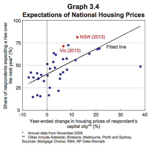
This chart got the RBA concerned:
“… expectations of future housing prices seem to be influenced by the recent past (Graph 3.4). This tendency was stronger than average in New South Wales and Victoria at the end of last year. The risks associated with this behaviour are likely to be macroeconomic in nature if households were to react to declines in their wealth and any repayment difficulties by cutting back their spending. “
The recent rise in interest-only loans (yellow line below) also has the RBA worried about whether speculation is rife.
They are so worried about house prices they are cracking open the weapons safe and rustling around for some ammo to try to scare off packs of hungry investors.
“The Bank is discussing with APRA, and other members of the Council of Financial Regulators, additional steps that might be taken to reinforce sound lending practices, particularly for lending to investors. “
“A speculative upswing in demand can also be damaging if it brings forth an increase in construction on a scale that leads to a future overhang of supply. This risk is more likely to arise in particular local markets than at the national level.”
The researchers look into entrepreneurship to see the demographic impact. It turns out to be bad news for those countries whose workforce is ageing.
The reason the researchers hypothesise is that younger people don’t get the experience they need to make a business fly. Their inherent capacity to think about problems in a new way is not matched with business skills. The reason for that is that old people are hogging all the senior positions.
“Workers may begin with raw talent and inherent creativity, but the acquisition of skills at work is essential to their founding a business. It is for that reason that the young are not the ones most likely to start businesses, even if they are the most creative. They must have time to obtain the skills on the job that will allow business that they found to succeed.”
Stuck at the bottom of the corporate ladder, it’s raining, and the economy is being ruined. This is your life.
The data support this model of thinking about entrepreneurship:
“The estimates imply that a median age that is one standard deviation lower is associated with a 2.5 percentage point higher country rate of entrepreneurship, which is about 40% of the mean rate. This effect is significant both statistically and economically, and is robust across different specifications, alternative measures of entrepreneurship, and among OECD and non-OECD countries.”
But older people have more business skills and experience. Does that help? Not at all, apparently.
“Within every age group, the entrepreneurship rate is lower in countries that are older.”
Japan is the sine qua non of this theory, with its fertility rate declining towards 1.0 and massive conglomerate companies full of ageing workers.
“[I]n Japan, none of the top 10 high-tech companies were founded in the last 40 years. New firm entry
rate dropped from the 6 to 7% range in the 1960s and 1970s to 3% in the 1990s (Acht, Thunik, and Verheut, 2004), which amounts to less than 1/3 of that in the U.S. and trails all the other OECD countries. “
Potato Drink? Japan, you’ve stopped even trying.
The researchers emphasise the importance of entrepreneurship to economic vitality. New companies tend to do things old ones just can’t.
“Existing companies can modernize and update their products and techniques of production, but the major innovations tend to be associated with entrepreneurship and the formation of new companies.
Many significant inventions of the last 150 years illustrate the point. Thomas Edison invented the light bulb and founded General Electric. The inventor of the automobile was Karl Friedrich Benz, followed closely by Gottlieb Wilhelm Daimler. Daimler-Benz is the product of their inventions. Alexander Graham Bell invented the telephone and founded AT&T. Guglielmo Marconi, the inventor of radio, was a founder of Wireless Telegraph & Signal in Britain. The Wright Brothers founded The Wright Company, which later became Curtiss-Wright. Steven Wosniak, who invented the personal computer, teamed up with Steve Jobs to form Apple. The list goes on.
In Australia, you might cite Kogan and Cochlear, A2 milk and Atlassian.
But to produce a handful of companies that are both new and extremely exciting, you need a steady stream of companies that are new.
And Australia has been performing worse and worse on that measure.
There could be many reasons this has happened. But the data doesn’t refute the theory that demographics should take the blame.
Everyone already knows the ageing of Australia’s population will create a major labour force shortfall. We’ve all heard that there will be fewer and fewer workers in the economy for every retiree (This article says the ratio will decline from 15:1 in 1909 to 2.6:1 by 2050). Everyone is aware of the fiscal imperatives around ageing. But the possibility that it is crushing the spirit of our economy is not something I’ve heard discussed.
Roads come in for close scrutiny and harsh words.:
“Roads are the least reformed of all infrastructure sectors, with institutional arrangements around funding and provision remaining much the same as they were 20 years ago.”
The competition policy review is listening to, and amplifying, the right sort of complaints
“Lack of proper road pricing also contributes to urban congestion, which is a growing problem in Australia’s capital cities. With road users facing little incentive to shift demand from peak to off-peak periods, greater road capacity is needed. As IPART notes: ‘During peak periods of demand, roads are allocated through queuing which imposes a far greater cost to road users and the economy than would an effective pricing mechanism.'”
“Lack of proper road pricing distorts choices among transport modes: for example, between roads and
rail in relation to freight and roads and public transport for passenger transport”
Having different subsidies for different types of travel makes as much sense as having different rail gauges across Australia. The point of competition law is to put options on the same footing for consumers (after taking into account market failures). But here, the rail gauge analogy is a good one, because it shows that coordinating what should be an obvious win for efficiency is actually going to be very difficult.
In competition policy, an ungainly solution like dual-gauge track is not available. Photo Source: Wikipedia
The report hangs its hat on transponders. This technical advancement will allow a new era of road-charging, the report argues.
“Technologies are available that allow greater use of cost-reflective pricing, which in turn could be linked to the provision of road infrastructure. This could make roads more like other sectors, where road authorities charge directly for their use and use the revenues raised for road construction and maintenance.”
But the report is chicken. It deals with the neat, obvious and simple issues of economic efficiency of road pricing. Do you really need a professor and a QC to tell you there are efficiency gains from pricing things in the economy?
What it doesn’t do is try to figure out a way to make road pricing happen. Except for this piece of wanton wobbliness:
“To avoid imposing higher overall charges on road users, there should be a cross-jurisdictional approach to road pricing. Indirect charges and taxes on road users should be reduced as direct pricing is introduced. Revenue implications for different levels of government should be managed by adjusting Commonwealth grants to the States and Territories.”
This is an injudicious turn of phrase. In setting expectations that avoiding imposing higher charges on “road users” should be the goal, it knots its own noose. Obviously, some people need to pay more. The word “overall” is poor choice since some people’s savings in fuel taxes, etc, will be less than their tolls. Perhaps the word “average” (which has a nice clear meaning) should have been deployed instead.
This paragraph is a nod to the idea that the issue needs selling. But as a political strategy goes, it is awfully weak.
The big impediment to road charging is not a lack of understanding of the benefits among those who read wonkish .pdfs. It’s a lack of desire for them . Road charging is actually completely different to the rail gauge problem, because 99 per cent of people couldn’t explain its upside. (Probably they’d mention politicians lining their pockets.)
The terms of reference for this review do not insist that the review panel stick to an economics 101 approach to looking at the issues. The terms of reference actually focus on making change happen:
“The Review Panel should also consider and make recommendations where appropriate, aimed at ensuring Australia’s competition regulation, policy, and regulatory agencies are effective in protecting and facilitating competition, provide incentives for innovation and creativity in business, and meet world’s best practice.”
This report is a welcome reminder that the issue of road pricing is still alive. It underlines that – through a process of elimination – road pricing is becoming one of our most pressing economic reform issues. But road pricing is a long way from having an effective support base, and is a million (untolled) miles away from being widely introduced. This draft report does little to change that.
The US consumer price inflation rate in August was -0.2 per cent. Negative inflation in the month and up just 1.7 per cent in the year. Despite the US Federal Reserve moving heaven and earth to avoid such an outcome.
The Fed has cut interest rates to near zero and done over $3 trillion worth of “quantitative easing” in order to try to lift inflation up into positive territory. That’s “loose” monetary policy where the government pumps money into banks. Their ultimate goal is to get higher inflation to give the economy a boost.
But there is another school of thought. That maybe the reason they’ve failed to cause inflation is that quantitative easing actually causes deflation.
This idea is shocking. When I first saw it getting serious attention, I had to check to make sure I wasn’t on The Onion. Surely QE is an increase in money supply, and so should cause inflation.
The list of governments engaging in QE includes the US, UK, and Japan. If it doesn’t work, then how in holy hell has the global economy not collapsed by now?
Here’s the data since 2000 on inflation in those countries
US began QE in late 2008; really ramped up with unlimited QE3 in Sept 2012Japan was doing limited QE over a decade ago. It really ramped up its QE in 2013. That recent blip in the chart is mainly due to a rise in GST/VAT, however.UK did limited QE in 2009/10 and 2012.
To me, these graphs look ambiguous. If QE causes deflation, how?
There are a few answers floating around, with the most often cited one being this (and it’s slippery):
“Quantitative Easing increases the total amount of money in circulation. That money has to belong to someone. It has to be in someone’s wallet or in some bank’s vault or somehow “held” by some person or institution. With the interest rate stuck at zero the only way that folks are going to agree to this if the inflation rate goes down. That’s because high rates of inflation make people want to hold less money and more tangible assets. This is what economists call an equilibrium condition.”
If the causation in this seems to run a bit backwards, that’s because the logic started off in mathematical identities about the economy, not in a verbal argument. (“the only way folks are going to agree to this” seems to be the verbal version of taking a variable from one equation and substituting it into another).
It depends on something called the “liquidity premium” which has to do with how much compensation people want to hold their assets in cash. To me, the causation runs the other way. You control your cash holdings, not the inflation rate. The idea agents can hold down the inflation rate just because they currently have a lot of cash seems silly.
But my belief in mathematical economic proofs is at the zero lower bound anyway, and you can’t argue too hard with the data (at least until you make a fail-safe counterfactual generator). Some sensible people are giving this idea credence, others not.
The idea that QE causes deflation is controversial. But the idea that it does not do much to lift inflation is more widely accepted. And that makes some people angry, because QE is not exactly costless.
One side effect is lifting the amount of assets the US Fed holds. It doesn’t just give out the cash under QE. It swaps cash for assets. So now the Fed owns a lot of “mortgage backed securities” – the same things that sparked the GFC – and that has some people arguing its solvency is at risk.
Another side effect is exchange rates. US quantitative easing can shoulder the blame for the high Aussie dollar over the last few years. That killed a lot of Australian businesses.
Australian house prices have seen inflation too, although not to the same extent. These trends have the Bank of International Settlements – the central banks’ central bank – in a flap:
“By fostering risk-taking and the search for yield, accommodative monetary policies thus continued to contribute to an environment of elevated asset price valuations and exceptionally subdued volatility.”
But the US QE program is finally coming to an end in October. The program which once added $85 billion a month in liquidity to the global economy is nearly at an end. It seems doubtful we will get a clear picture of what the effect was on inflation from this one program.
We may need many more iterations of financial crisis and government response to figure it out, and that may be just what we are going to get.
As AFL comes to dominate the Australian sports landscape with its multi billion dollar TV deals, glorious stadiums, own media arm and huge paycheques for star players, a surprise competitor is rising.
Football without glitz or glamour (or tickets) is having a resurgence.
Interest in VFL and SANFL growing on Google trendsInterest in AFL stagnant and even ebbing on Google trends
I am seeing a lot more mentions of semi-pro football on social media. People on Twitter are barracking for the Box Hill Hawks. People on Facebook are getting behind the Norwood Redlegs. And they are as enthused about the price of the beer as about the quality of the football. It’s a holistic assessment of the quality of the experience.
If you go to a game in one of these leagues, you might be able to walk there. And at quarter time, instead of being insulted by advertising, you can go onto the field and listen to the coach address the players.
Half time entertainment, VFL style. Photo credit: Simon Arden
Interest in AFL seems to have waned a little. The AFL has seen average crowds fall back to the levels of 15 years ago.
Is the AFL experience good value? I paid $40 to see a finals football match last weekend and you can’t deny the view is good and the atmosphere is vibrant. But a pie and a drink will set you back a further $15. It’s not exactly cheap family entertainment any more.
Overall, AFL has been growing its audience through broadcast. But even it admitted falling viewership on the free-to-air stations in its 2013 annual report:
“Seven Network audiences were slightly down year-on-year (0.7 per cent), a smaller decline than the decline for Australian free-to-air television ratings generally, while viewership on subscription television increased by 6.3 per cent year on year. FOX Footy in 2013 remained the best performing channel on the Foxtel platform in five capital cities (Melbourne, Sydney, Brisbane, Adelaide and Perth)”
As any music artist can tell you, having a product that is consumed via broadcast is no way to make money. And AFL tickets cost so much now that the game is a premium product. Is there space for a challenger? Could we end up like US football, with two popular leagues of different standards?
In the US, College Football is a $6 billion industry, barely smaller than the $9 billion NFL.
This Stephen Fry video gives a sense of its scale:
In any market, there is always room for a competitor. This is especially the case when an incumbent has been making big bucks, licking the cream from its whiskers and looking self-satisfied.
The AFL is Apple, and the smaller leagues are China’s XiaoMi, offering a product that’s never going to satisfy the die-hards, but will tempt many on price. If you are thinking about taking a handful of primary-school-aged kids to the football for the experience of it all, there’s no doubt VFL offers a pretty compelling alternative.
The VFL (then the VFA) has offered competition to the top league before.
“In 1960, the VFA first allowed premiership matches to be played on Sundays. After years of losing ground to the VFL, the VFA’s launch of Sunday games was a turning point for the better, as it allowed matches to be played without competing the VFL for spectators. Within a few years, clubs found that Sunday matches were as much as three to four times more lucrative than Saturday games.” (Wikipedia)
The only hiccup in this whole competitive narrative is the fact that the AFL and VFL are actually associated. But the SANFL is independent, and so is the WAFL. And the VFL and AFL have only been associated since 2000, so the link is not necessarily written in blood.
Is Australia ready for two separate, popular Aussie Rules football competitions in each football-loving state? I suspect the answer will be yes, especially if the AFL doesn’t do more to cater to grass-roots spectators.
Economists like to divide up our lives into work and leisure. Like a lot of economics thinking, this is just a model. It compresses some details to make issues tractable. Which is normally fine.
But this model is very powerful – it is very widely accepted, and used outside the profession. The average punter is able to say, well, the cost of pizza delivery is $4, and it would take me 15 minutes to go to the shop and back, so I should get the delivery if I value my time over $16/hour. Since I make $20 an hour, I’ll get the delivery.
If this labour/leisure model fails, a lot of our thinking about the labour market needs a re-think. And this model fails in many ways.
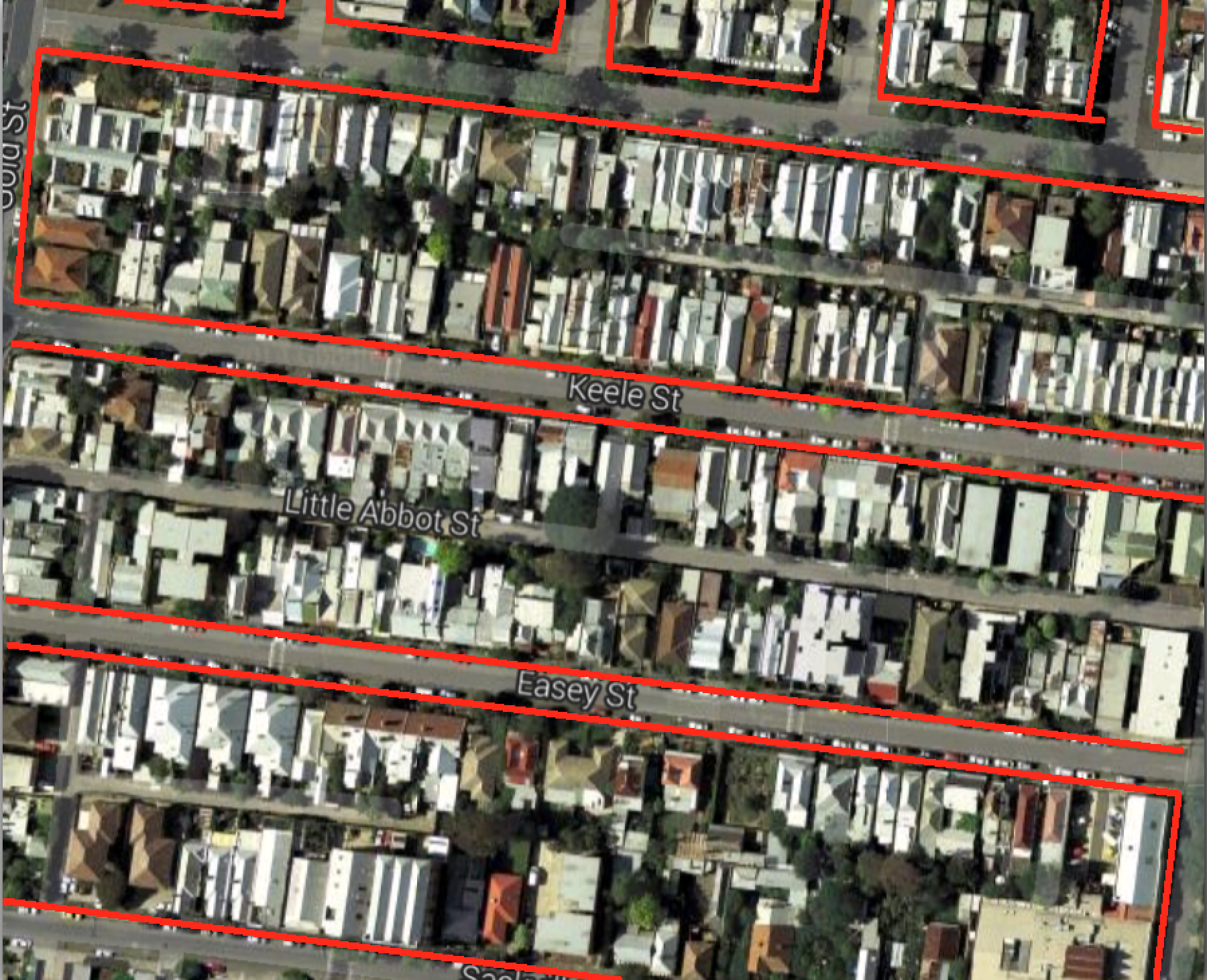
Sell off the street in front of your house for development, leaving only walking access.
Streets – outlined in red – take up about 30 per cent of this area in the backstreets of Collingwood.
Google maps draws streets as thin little lines, but that is misleading. They can be wide, sometimes more than half as wide as the blocks are deep. Is dedicating so much land to traffic really wise? Especially where you have dead-ends, those streets are minimally used. The last 20 metres of a cul-de-sac might see only 10 car trips a day. To me, that seems wasteful.
Selling off your street would be unacceptable in a scenario where house prices were low. But Australia’s house prices are high. It makes sense to use land for its most valuable purpose.
The land in front of my house and the neighbours (which is also, of course, in front of our neighbours opposite), might be worth $500,000. If the decision to sell it off meant a windfall of $125,000 for all four parties, all parties might be tempted.
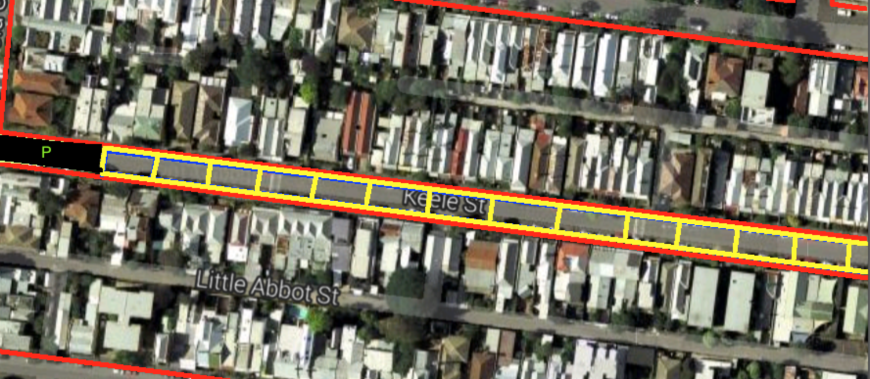
The way to make this work would be to build a parking structure within a reasonable distance. The land at the end of the street, nearest to the main road, would be a logical place for that.
Yellow squares would be new lots for development, black area at left is new parking area
This hypothetical might seem odd. It’s not standard to think of suburban streets as optional. But we should ask why they are compulsory.
Walkable laneways for access are part of some very desirable housing options, including big resorts and hotels, big apartment developments, and whole cities, including this car-free city in China, the “old towns” of many cities of Europe, and of course, this little place in Italy.
I was inspired to think about whether we really need all our suburban streets after reading about road pricing in a recent speech by the head of the Productivity Commission.
There are already tolls on some of our most popular roads. But the vast majority of roads (by length and by area under tarmac) are side streets. Attempting full cost recovery for these would be very expensive for the people who use them.
If my street cost $10 million to build and requires a return of 7 per cent, the locals must generate $700,000 a year in revenue. If there are 50 car trips a day ( a car every 20 minutes in the 16 waking hours), those trips will be charged at $38 each. Ouch.
You might not sell off the land in front of your house when the alternative is a lovely street you get to use free of charge. But if that street were tolled, the combined carrot and stick might change your mind fast.
If you lived on a main road, obviously it would not be in the public interest for the land in front of your house to be sold. But equally, the number of people using that road would be much higher, so the toll would be a lot lower and the “stick” part of the equation less compelling.
Obviously there would be massive coordination problems and equity challenges associated with such a plan. Selling off the road at both ends of the street would pretty much force the people in the middle to do the same. And if someone with major mobility problems lived on your street it might be unfair. This hypothetical question will remain hypothetical for a very long time.
But the fundamental issue here is not unlike the question of burying rail lines, providing surface parking, or putting roads in tunnels. What is the most valuable use of our scarce city land, and how much are we relying on legacy structures to determine those uses?
“The Fire itself is not a policy proposal,” the researchers write. But that little caveat only comes after they list all the virtues of conflagration, and you get the feeling they threw it in as an afterthought.
“The striking initial result is that land values increased immediately in the burned area, relative to the unburned area.”
Not just building values, but land values. In addition, building values rose as owners replaced the old buildings with better ones.
“Building values increased substantially in the burned area, following reconstruction, and converged over time..”
They confirmed their data by comparing to other smaller fires.
“The great extent of the Fire appears central to its impacts, … Building values increased following single building fires, but building values increased by more following the Great Fire. Further, while land values increased following the Great Fire, burned plots’ land values were unchanged following an individual building fire.”
The theory is that the structure of the city changed in some important way. That each individual building had spill-over effects, or externalities, that were turned from a mix of positive and negative, to mainly positive.
“The Fire’s impacts are indicative of substantial inefficiencies in even wealthy urban areas. Indeed, the implied magnitude of inefficiencies is even larger because even widespread reconstruction after the Fire is not predicted to obtain first-best land-use in the presence of neighborhood externalities.”
The theory that new buildings have positive spill-over effects looks good, because land values also increased in area adjacent to the fire, that were not actually burned.
They rule out a couple of other explanations:
Increased agglomeration. It seems industries didn’t move.
Improved infrastructure. The pipes weren’t damaged and didn’t get replaced and plans to improve and change the road network (other than some widening) met with opposition
So what’s the point of this research? I don’t know of too many cities where the advice to knock it down and start again might really take root. (Perhaps Sydney?)
The list of cities that have been knocked over and started again is a list of powerful cities. London had its great fire in 1666. San Francisco had its big earthquake in 1906, which destroyed 80 per cent of the city. Napier had a big quake in 1931 and turned its bad luck into an art deco renaissance.
The research is relevant to the residents of Christchuch, still in recovery mode after their 2010 quake. The message might be: don’t move away just yet, this all could work out, economically speaking.
It also suggests good results well for urban infill in less-favoured parts of the city. Buying the lots next door to a big new development could be a smart investment.
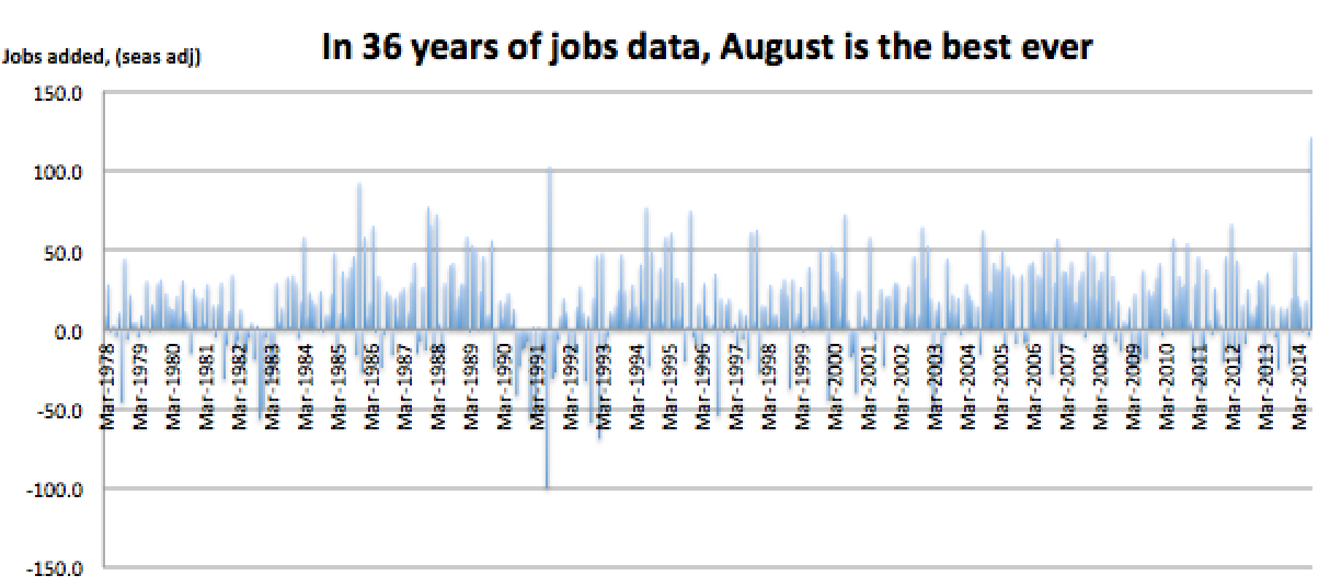
Today the ABS released its usual monthly employment figures. It’s been a normal-seeming month, so what happened next was pretty surprising.
The economy set a record for the most jobs added in a month!
Is there something wrong with the way the ABS treated the data? Maybe. Seasonal adjustment is something they do every month. It allows for months to be treated the same and it is usually helpful. You can compare, for example, the underlying job trends between December, when shops are hiring for Christmas, with January, when all those casuals get let go.
It seems like August is a month where the seasonal adjustment team is very busy. The survey result for August was +32,000 jobs before they seasonally adjusted the data. The adjustment took it to +121,000 jobs.
But if months start behaving differently to how they behaved in the past, seasonal adjustment could make things worse. Here’s 20 years of August numbers (prior to seasonal adjustment). Something is different this year.
But July’s data surprise was not in the number of people with a job. The survey design change was about “looking for work”. Having a job is far more clear cut and July’s figures showed very small and reasonable falls in unadjusted and seasonally adjusted terms. (-11,000 and -4,000 respectively)
So what’s most likely?
Is it that August has started behaving differently and seasonal adjustment needs adjustment?
That randomness explains the outlier?
Or that the economy has really, truly, but very quietly, turned a corner and added a lot more jobs than we expected?
We may need more data to answer this question… Stay tuned for next month!
UPDATE:
I broke down the jobs growth series into full time and part time
Prior to adjustment, the figures are :
part time +112,000,
full time -80,000
This means that our massive apparent boost in jobs is dependent on raw survey data that shows 80,000 full time jobs were lost. I trust the ABS but this is weird.
+112,000 is not even a record month for part-time jobs. March 2014 set the record with +168,000.
I ran a correlation that showed full time and part time jobs growth are weakly negatively correlated. Perhaps that means since part time job growth was high they expected a really big fall in full time jobs, that didn’t materialise.
The state opposition here in Victoria has just announced it will cancel the contracts for an $8 billion tunnel if it wins the election in November. (While it’s true there’s often a big traffic jam on the road in question, the tunnel fails both cost-benefit analysis and any assessment of what sort of infrastructure the city will need in the future).
THE POLITICS
Deciding to cancel the contract is a bold call, and I suspect, the result of intensive polling. Of course, the government saw this coming, and has a strong line of attack running, calling opposition leader Daniel Andrews an economic “vandal.”
In pledging to cancel the contract, Andrews leaves open the question of what he might do instead, and he doesn’t seem to have much of an answer.
Of course Labor doesn’t want to make new giant policy pledges, before the election. The end of the road project would mean, however, that some money becomes free.
Labor still has as part of its election platform the construction of a major rail tunnel – “Melbourne Metro”. Both parties are pretending these two mega-projects are not alternatives, with the coalition government pretending to progress the rail project alongside its favourite road. But realistically, the expense and trouble means the projects are an either/or. Cancelling the road contract is an essential input to building the rail project, it’s just that Labor can’t really admit it.
Assuming the “vandal, Naysayer” tags don’t stick, and the lack of a clearly defined alternative doesn’t hurt Andrews much, I think this is smart politics. Voters like a clear choice and the sniff of real leadership.
The seats that would benefit from the tunnel are mainly Liberal strongholds, and I think if Labor focuses on talking about health and education for the rest of the campaign (and especially if Tony Abbott pops his head up) Labor will win the election.
THE ECONOMICS
Promising to tear up the contracts, before they’ve been signed, is a big risk on the part of Labor. I can imagine Lend Lease and the infrastructure minister sitting in a room right now, amending the cancellation provisions. $100 million? Why not $500 million? Protecting the project and/or hamstringing Labor could both be achieved in the stroke of a pen.
We rely on their good citizenship not to do so. A flimsy protection indeed.
Of course there should be some cancellation provision. A lot of money has already been spent on this project. But from an economy-wide perspective those are sunk costs and we ought to ignore them.
The companies that are selected to build the tunnels will seek sympathy. They will talk a lot about all the investments they have made – hiring people, doing mapping, buying diggers, etc. But we should not listen too closely:
Until just this week there were two bidders in the running for the project. Each of them faced a chance of missing out even if the project went ahead.
The prospect of the project being cancelled was obvious. I bet they haven’t actually made a dedicated unilateral investment in this project for months. Anything they have bought will probably be able to be sold or moved to other projects.
Generous contract cancellation provisions arguably makes this money for jam. When you start building a project, there’s risk of making a loss. When it gets cancelled before you begin, any compensation is pure profit.
The real impact of this cancellation will be felt in future projects. Political parties will have similar incentives to infrastructure companies. Both have incentives to prevent the opposition cancelling the contracts.
If Lend Lease offers Labor a contract for the rail tunnel that includes a slightly lower total cost but enormous contract cancellation provisions, Labor will leap at the chance to protect their project from the whims of future administrations.
There’s game theory at work, and this might be the last chance we have to cost-effectively vote out a project of this kind.
If tax reform is boring, that’s because it’s run by boring people. Economists can spend hours sitting round teasing out the intricacies of an allocative efficiency improvement.
But when it comes to convincing others, economists tend to stroke their moustaches, repeat the word “productivity” and wave their laser pointers at a dense thicket of lines on a graph.
We need some marketing type thinking to help us economists. There is no other way the Australian public can be swiftly convinced of the merits of new taxes. And convinced they must be, because the economy needs all the productivity gains it can get to lift incomes.
Land tax is the best tax. Everyone who understands economics knows it. It’s minimally distortionary.
“Well-structured taxes on land … are a highly efficient means of raising revenue.” [Henry Tax Review]
“… raising the percentage of tax that falls on the unimproved value of land has few distortionary or adverse affects…” [Macrobusiness]
“People will be paying between 20 to 40 per cent more in land tax. The bill will also diminish Queensland’s ability to attract interstate and overseas investment which will ultimately flow through to impact employment” [Property Council of Australia, cited in the Australian]
We need to change people’s beliefs about taxes. But more than that: we need to change people’s feelings about taxes.
At the moment, land tax is wildly unpopular, while the luxury car tax is wildly popular. I theorise that people like the idea of a tax they can avoid, hate the idea of a tax they can’t avoid.
So how do we change people’s feelings about unavoidable taxes? Do we lecture them about deadweight loss and distortion?
I can feel the eyes glazing over already.
We need something far punchier, something that fires the emotions. Something a little bit like this…
The ad starts with the bespectacled taxman knocking on the door of a large mansion. “Tax time!” he cheerfully announces.
The door is answered by a butler, before a rotund, pinstriped individual arrives and pulls his pockets inside out. His face affects an attempt at sorrow that barely conceals a smirk.
The taxman’s brow furrows in disgust and we zoom out to see him walking back down the long gravel driveway, past an array of parked supercars.
Cut to an exterior shot of a big city accounting company. The voiceover intones: “They can hide income. They can hide capital gains. They can even hide the companies they own. But they can’t hide land. Land tax now for a fairer Australia.”
I’ve discussed this kind of idea before, with a “Trevors in Traffic” campaign to promote congestion charging. The point is that you can’t start arguing for a solution when people don’t even understand there is a problem.
“I remember reading about a behaviour change campaign to get kids to wash their hands. Rather than starting with facts about soap, they started with an ad that dramatised germ transfer. Everything the main character touched after leaving the bathroom turned green. Understanding the problem (even in a stylised way) came first.”
Teaching people about the allocative efficiency of various taxes is going to be expensive. You’d need TV ads, newspaper ads, a PR blitz. But if it greases the wheels of tax reform, it could be the best money ever spent in the Australian economy.
In 2004, I attended my last exam at the University of Melbourne – 316-303 Industrial Economics. As the “pens down” call went out, quiet fell. The ratcheting sound of my HECS debt accruing was finally gone.
The day I graduated, that debt was around $30,000.
I went on to add a bunch of credit card debt that final summer of freedom, flitting around the northern hemisphere in the knowledge that I had a job waiting for me in Canberra when I came back.
Christmas 2004. I had to shave when I came back home.
But while that $6000 of credit card debt was paid off within six months of working full time, the $32,000 took 10 years of nibbling to finally destroy.
HECS is a system that allows you to buy education now and pay later. You rack up debt on every subject you study (arts costs less, medicine more). Then you only have to pay it back once your earnings go over a certain level, currently $51,309.
The idea is for people who get a big benefit out of their tertiary education to put some money back into the system to help keep it afloat. The genius of HECS is that it – in theory – shouldn’t deter people who come from less wealthy backgrounds, or have lower expectations of their lifetime earnings. If they never earn above the threshold, they never pay it back.
My HECS debt shrank steadily for several years, then picked up again in 2008 when I left the federal government to sample a life of leisure, etc. The knowledge that the HECS debt you worked hard to eliminate is creeping back up does tend to haunt those otherwise blissful idle hours. Perhaps that’s the point. But the good news is it only ever goes up at the rate of inflation.
So long as wage growth outstrips inflation, your HECS debt is getting smaller in practical terms.
There were always deals available where you could trade cash now to eliminate your HECS debt with a small bonus. But I never took them, preferring current liquidity and betting that my future wages would make my HECS debt seem small. (After choosing to work in media, I never really reached that point.)
By the end, the impact of HECS on my paycheque was quite annoying. I would much have preferred the few hundred extra in my hand every time. But then, while I wasn’t paying attention, it was gone. Hallelujah!
The lessons of HECS are this:
When the government adds a few percent to your fortnightly tax bill, you mostly don’t notice.
Income contingent loans seem like a very fair kind of user-pays. We should use them for other things. For example, sports.
The zero real interest loans are really nice. If it weren’t for them, I’d be up to my eyeballs in debt still, like some New Zealanders I know. Education Minister Christopher Pyne wants to introduce positive real interest rates. I think that could be justified only if you ignore (or don’t care about) the deterrent effect. Students with less access to economic resources are already far less able to attend university, and the prospect of enormous mounting debts will only make the challenges worse.
We live in a new era. A time unprecedented. An age where the economy shifts as fast as you can send ones and noughts along optical fibre, and the job you’ll have in five years time hasn’t even been invented yet. Right?
Not right.
My favourite labour economist is Jeff Borland, and he specialises in truth bombs, which he distributes in his monthly labour market snapshots. I’ve written them up before, for example, here.
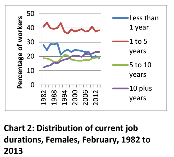
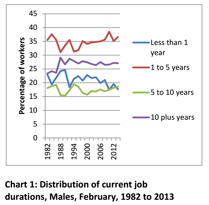
He crunched the numbers and found that despite the decline of unions, the march of neo-conservatism, the lingering influence of Peter Reith and the legacy of workchoices, job durations are as long as – or longer than – they were in 1982.
Borland:
“If I had a dollar for every time I have heard that: ‘Young people entering the labour market today are going to have many more jobs during the course of their working lives than older generations’, I might not be rich, but I reckon I would be owed about a thousand dollars.”
For the last dozen years (at least), he’s been a professor of Economics at Melbourne University, so he knows tenure. In that time I’ve had probably ten jobs, so this news is very surprising to me.
What else is interesting is that people feel (and are) relatively safe in their jobs.
I suspect they feel even safer since the Abbott government started polling about as well as the Gillard goverment. The chances of frightening workplace reform coming out before the next election would have to be slim to nil given the reputation of the government right now.
Is the ice-bucket challenge over? Done and dusted? Even boring?
Geometric progression – each soaked individual challenging three others – meant it spread from celebrities like Bill Gates, to people like me within just days.
The history of the ice-bucket challenge is surprisingly deep.[source] Over a year ago a “cold water challenge” was getting limited traction on social media in America, related to charitable donation in general. It was low-visibility for a long time.
Then in June 2014, at the start of US summer, it somehow morphed into an “ice-bucket challenge” and first got into mainstream media via a golf channel.
In mid-July, golfer Greg Norman challenged an NBC TV anchor who completed the challenge. At around the same time, another golfer tied the ice-bucket challenge to ALS, a disease which kills nerves in charge of movement in the brain and spine. The rest is history.
There is a lot of dispute about the “rules” of the challenge. Do you tip the water on your head AND donate? Or are they alternatives?
This ambiguity seems to actually help. Some can afford to donate a lot, others only a little, but everyone can to play the game. That helps it move forward.
But this is more than just another viral trend, like cat batmans.
The gold at the heart of the ice-bucket challenge is making middle-class philanthropy public.
Perhaps if you dig into someone’s Movember page you can see who is generous. If you do a charity fun run you know who digs deep. But mainly, giving by average middle-class people is anonymous.
This is despite that fact it is established that social pressure encourages donations. Is it a coincidence that the very wealthy give a lot and they give in public? The Shane Warne Foundation. The Sidney Myer Fund. That gets them kudos on top of tax deductions. And it stands to reason that the bigger the benefit, the bigger the donation. That’s basic incentive theory.
The ice-bucket challenge’s charm is this: you no longer need to provide enough funds to build a new library at your alma mater to be able to be recognised for your philanthropy. If you’re especially high-minded this might seem tacky, but you can’t deny it. People want something in return when they give. Social media stardom and recognition, it turns out, is enough.
This is actually a really good thing.
Even if you have begun to find the ice-bucket challenge boring, and think “donating for likes” is crass, you can’t deny that seeking likes for donating is better than seeking likes for a tropical poolside recline, or for a photo of some toast that looks like David Beckham.
Young people (25-34) donate least to charity, averaging just over half as much as the 65+ bracket each year. Things like the ice-bucket challenge can change this. And activating the great mass of people to donate makes more sense than chasing a few rich donors. Average middle class people give the most as a proportion of their income:
Mosman, Balmain and Vaucluse top the list in dollar terms, but not percentage terms.
Right now, in the board rooms of charities world-wide, they are trying to figure out ways to replicate the success of ALS, with a similarly viral campaign. (If I was advising a charity, I’d suggest something involving cats. The internet loves cats.)
The charity sector will have failed if they do not capture the current public enthusiasm for low-level philanthropy. Expect to be challenged to donate to something else very soon!
Innovation is a shifting sand of the economy. Just try to define it. The moment you do, you’ll realise how deep into the dunes we’ve trekked and how badly lost we have become.
Examples of innovation seem easy to come up with: The espresso machine is an especially pertinent example at this time of the morning.
But the ABS definition of innovation is this:
“The development or introduction of new or significantly improved goods, services, processes or methods is generally considered to be innovation.”
Development orintroduction. So where does innovation matter most? Is it the invention of the espresso machine? Or is it when I install one in my restaurant? The former allows one person to register a patent and collect rents. But the latter is where the masses get the value. The latter is underappreciated
Rustic loaves you have to slice yourself, and cost $9. An innovation?
Under the definition, an innovation need not be new to the world, just new to the business.
Deciding to replace the chairs in my restaurant with padded ones could be considered the introduction of a significantly improved service that might add a lot of value for my customers. Likewise, installing a simple accounting software at a business might be the best innovation it has seen in years.
What’s more, this sort of innovation requires much less R&D so its benefit to cost ratio is much better.
Suddenly innovation seems less sexy.
You might want to be a purist and focus on inventions? Okay. But for a small country like Australia, with less than 1 per cent of the world’s population, we can’t expect to invent even a tenth of the innovations we use.
By far the majority of progress in our country will come from introducing concepts and ideas from offshore. Some of them may be recent ideas, but others, like the ways of doing business at H&M or Uniqlo, are well-established and scarcely seem to a mid-ranking federal minister like “innovation” at all .
ユニクロ. NEW!!
Any change that lifts business performance should be classified as innovation. Nevertheless policy seems to focus on the brightly shining examples of research and development and invention. (Perhaps the latin root’s emphasis on the newness is part of the problem?)
As part of this invention-focused Innovation Agenda, a huge amount of lip-service is paid to the idea of “commercialising” university research.The government frets over low commercialisation rates and universities invest a bunch in commercialisation offices. There are two big problems with this.
1. 99 per cent of new ideas developed in universities are not going to be commercially relevant, or at least not now.
2. The incentive structures of academics are designed so there is no point for them in getting anything commercialised. Patents are pointless when you’re going to get promoted on how many papers you produce. The commercialisation offices hold too few carrots to get anything real done.
The government can continue to produce glossy reports on Australia’s “National Innovation System” but we will continue to be chasing our tails so long as we, as a society and as a group of policy-makers, obsess over the use of this hopeless catch-all word. We should focus on productivity improvements, technology uptake, inventions. But they all need different policy levers.
The ABS counts a business as “innovation active” if it introduces or abandons a new idea. I like that. I think one of the best innovations we could introduce in this country would be to abandon the word innovation in order to more clearly focus on the things it is trying (and failing) to convey.
Whisky investment is the hot topic among my friends. A very nice-looking Tasmanian distillery is offering a great deal.
You buy a barrel of whisky now, and they keep it for you. In four years it matures and you get a choice. You can either get your money back, plus a 9.55 per cent per annum return, compounded, – or you can have the barrel bottled and take delivery of a whole lot of bottles of whisky. Or a mix of money and whisky.
This model is well-established in the wine growing regions of France where it is called En Primeur. Top Bordeaux vintages are sold out while the grapes are still green. The concept makes even more sense for a distillery – the time between first harvesting the grains and having a decent, drinkable product is long. The distillery needs capital to cover that period.
The company guarantees the purchase of the Whisky at the end of the four year period. And if you buy the barrels, they send you a gift:
“Valued at over $1,000, each gift box contains a bottle of Nant Single Malt Whisky together with a Crystal Decanter Set.”
They are also busy promoting the Whisky. There are four bars in operation – three in Brisbane and one in Melbourne. They also have Queenslander and Australian cricket legend Matthew Hayden as a sort of brand ambassador. His face is all over the website.
The Nant Distillery Company is registered in Brisbane, and that’s where its CEO Keith Batt seems to be from. His LinkedIn profile gives a sense of his business skills.
This business seems to be run by someone credible. So why not just get a bank loan? Does it make sense for a distillery to pay a whopping 9.55 per cent per annum on its capital?
A residential secured fixed term small business loan goes for 7.1 per cent, according to the RBA. But that is a secured loan. If you go broke the bank gets your house.
The difference here is that the barrel owners will not be “secured” creditors. I’ve been to quite a few creditors meetings in my time as a financial journalist and the difference between being a secured and an unsecured creditor can be the difference between millions and zip.
The investment is only a good one if you think the risk is low. How bad could it be?
Is this a scam? Keith Batt bought the distillery in 2004, and from what I can see the first mention of Whisky investments was in early 2010, around the time of their first bottlings. I guess those first people should have cashed out their Nant investments by now, but I haven’t found anyone raving about it online.
Let’s assume it’s all above board and look at the gritty details.
The price of the “Great Australian Cask Offer” is $30,000 for two 225L barrels. 450 litres @ $66.66 a litre. You can buy smaller amounts too (225L and 100L), and weirdly they work out slightly cheaper, at $66/L.
That price, for the people playing along at home, is high.
A litre of Johnny Walker Black Label would be $61.21, and that is in a bottle, in a Dan Murphy’s near you. Not down in Tasmania in a barrel you can’t drink for four years.
You also need to take into account GST (which is included in the $30,000 price, and which you can claim back if you have an ABN) and what they call the “angel’s share” – evaporation. Every litre turns into say 900mL over four years. But you’re not exposed to the cost of that shrinkage if you sell them back the barrel.
The Big Question is whether they’ll be able to afford to buy it back.
1. The company is solvent but the whisky is destroyed. There could be a mudslide, or that pretty antique building could collapse. Termites might get in the barrels or vandals might break down the doors. Do you technically own the asset? Who has to insure it? Is it insured for the amount you paid, the amount you were promised in return, or its market value?
2. The whisky is fine but the company is insolvent. Do liquidators have to give the whisky back to the investors? I doubt it. I suspect they sell them off to pay back secured creditors.
So the whisky investment is a risky investment. That’s why the return is good.
But even risky investments don’t go bad every time. And in fact there are examples of such an investment scheme actually adding value to a company. There’s a burrito bond on offer in the UK, for example, which has raised 1.8 million pounds.
The owner of that Mexican food concern sees it as a marketing coup: “We now have hundreds of extra brand ambassadors,” says Chilango co-founder Eric Partaker.
In a crowded whisky market where the skills to distinguish good whisky from bad are the province of relatively few, having hundreds or thousands of people with a vested interest in believing your whisky is worth every penny might be the smartest marketing ever.
Cheers to that!
EDIT: The prospectus is here: Prospectus for 100L barrel. It talks a lot about volume growth at the top end of the market and the rise of premium and super-premium brands.
He reckons house prices will keep going up while the mortgage rate is not much more than the rental yield. He also theorises that Sydney prices rise first, and the rest of the country lifts thereafter. This theory holds water for me on an intuitive level. In the short run, a house in Melbourne is not a good subtitute for a house in Sydney, but in the medium term, perhaps it is. In the long-term, perhaps even a house in Adelaide could be a substitute!
But house prices in Melbourne seem a bit high to be making bold acquisitions for speculative purposes.
Luckily, house prices are very different across Australia. Sydney is way out in front. Perth, Melbourne and Canberra are a cluster. Then Brisbane and Adelaide are limping along at the back of the pack. Hobart doesn’t make the graph but it is somewhere back there too.
If you wanted to buy a house somewhere cheap, which makes most sense?
You’d want to choose a place with strong growth prospects. In recent times, all three laggards (Brisbane, Adelaide, Tassie) have shown a bit of pluck when it comes to the labour market (focus on the yellow lines).
Now, despite its “beautiful one day perfect the next” weather, Brisbane doesn’t rate a mention in the top ten cities ranked by the Economist for liveability.
Melbourne scoops that award every year (Adelaide came 5th this year in results released today). But while we are being open-minded, it’s worth noting that that survey is horribly biased.
You’d think getting married is relevant to your home life. You wouldn’t expect it to change your employment outcomes.
I mean, I’ve never done it, but I doubt you get back from your honeymoon buzzing with a desire to read and reply to all those emails.
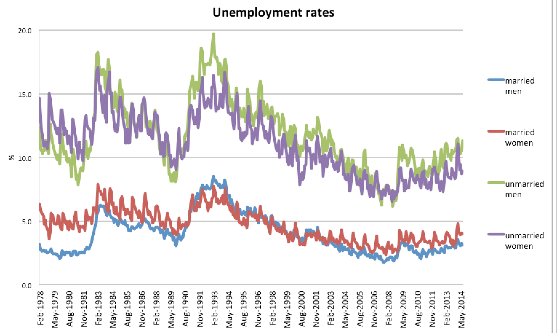
And yet, the correlation between marriage and labour market outcomes is quite astounding.
The unemployment rate for unmarried men is nearly four times higher than for married men (11.3% vs 3.1 per cent). For women, the ratio is over two (8.9% vs 4%).
The difference between married and unmarried makes the difference between men and women look small.
Essentially, if you are a married man, you’re living in a labour market no different from the best parts of the 1970s, with 3 per cent unemployment!
Might this be a statistical artefact? It could come about because the young have poor employment outcomes, and are less to be married. Let’s have a look at an older age bracket.
The absolute levels of unemployment have fallen, especially for men. But the ratios of unemployment rates between married and unmarried are about the same: 4:1 for men and 2:1 for women.
The above graphs make it look like married people are all hard at work in the office. But the unemployment rate hides a big difference in participation rates.
There are two distinct clumps in this chart. Married men, who participate in the workforce at a rate of 95 per cent. And everyone else, who participate at around 75 per cent.
The 80s were a time of rapid change for women. But since 1990, one of the biggest changes in the employment market has been unmarried men dropping out of the labour force. Their non-participation rate basically doubled from 10 per cent to 20 percent.
Given the unemployment graphs on the previous page, I’d be very surprised if the red line (married women) didn’t tick up over the green line in coming years.
Two mysteries remain.
1. Why is the difference between the married and unmarried so strong, and so consistent over time?
I have a few theories.
Perhaps the unemployed are busy proposing, but are rejected because they are unemployed?
Perhaps there are confounding variables, like good looks or intelligence, which are correlated with both earning power and marriageability.
Perhaps it’s not about the kind of people they are but the incentives they face:
Obviously marriage and children are correlated. Obviously children (who are cruelly forbidden by the law to earn the money to feed themselves) are expensive. Could it simply be the compulsion to put bread on the table that explains why married people are so rarely out of work?
2. Why is the labour force participation rate of unmarried men eroding?
Can that explain the fall in unmarried men’s attachment to the labour force?
(They are also increasingly likely to have a non-religious ceremony, but I’m not sure that’s relevant)
I’m not sure it does, and this makes me wonder if perhaps the “discouraged worker effect” might be true. All those unmarried men might once have worked in factories. Maybe they’re less able or inclined to take service sector jobs.
There might also be an echo of higher immigration rates in the data. The overseas born have lower workforce participation rates. (chart source)
Which looks like a nice simple story, until you fold it back in on itself and see that immigrants actually get married at a higher rate than their proportion in the population! (Number of marriages is on the vertical axis, so in total, this graph shows that at least 40 per cent of people getting married in Australia are overseas-born.)