UPDATE DECEMBER 2016:
This post is miles off! It was all predicated on the numbers coming out of the ABS. What I didn’t realise was the extent to which they would be revised. Because sales of dwellings are reported late, the data get revised up. Generally 3 months afterward.
So. Here we are three months later and I can tell you the number of houses sold in the 3 months to June 2016 got revised up by 26 per cent. The scary looking charts below represent missing data. Sales have barely trended down at all.
I leave the post below for the sake of completeness.
–
When it comes to house prices, people usually just focus on the average price for sales in the last period. But a market is about more than just prices.
It is also about sales volume. And luckily, there is lots of detail in today’s official data on volume.
The market has suddenly turned skinny. Not so many homes are trading hands compared to recent history.
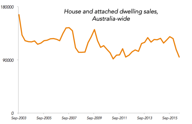
That is a pretty steep drop, and when you break down the data you find that it is mostly centred on detached houses (as opposed to attached dwellings, which include units, flats and terrace homes.)
The fall in sales is concentrated mostly in Melbourne and Sydney, but also Brisbane.

Now, there are reasons to not trust the newest, lowest datapoint. It will get revised upward as real estate agents hand in their data to the ABS. (Update in December: In retrospect this paragraph is the best part of the whole post.) Last year’s June quarter was revised up almost 50 per cent! If that happens again the results look less dramatic. But the fall is not all about the latest data point – it looks to have been going on since the start of the year.
If the apparent trend survives, this looks like a serious shift we should pay attention to.
The question is whether this information has any value. My quick analysis suggests it just might.
In previous times, plunges in the volume of houses sold have indicated the start of periods where prices faded away. The yellow periods in this graph go from the start of a fall in volumes traded to the end of the slide in median house price. You can see a house trading volume fall can mark a period of house price stagnation.

For another look at those yellow periods, here’s the RBA’s housing prices graph. 2008 was a shorter sharper dip and mid 2011 was a longer one.

Might we be about to see the lines head back below zero? And if so, how far below zero will they go?
