How do you get a country excited about tourism?

1. Tourism is super important, accounting for 10 per cent of Australia’s export earnings.

Screen Shot 2015-02-20 at 10.21.26 am
Services are our second biggest export sector and tourism is Australia’s largest services export.

2. Tourism’s moment has come.

Source: Yahoo Finance
Australia: on special. Source: Yahoo Finance

3. International tourism is understood to have public good aspects (e.g. brand Australia) that warrant some public spending on attracting visitors. Tourism is also a public policy issue because regulations around immigration and customs, aviation and airports can determine the cost effectiveness of a trip to Australia.

But at this crucial moment for the industry, government funding for Tourism Australia has gone from $132 million in 2012 to $129 million in 2014.  That’s a fall from $21.29 per visitor to $19.64.

sydney

4. The Government does not have a minister holding the title of Minister for Tourism (they do have a Minister for Sport). The Trade minister has tourism in his portfolio. But he has been accused of “neglect” for the sector.

5. There have been no data released on overseas arrivals since September 2014. The Department of Border Protection changed the arrival cards and completely screwed up the system that had delivered excellent monthly data for the previous 14 years. The timing of this mistake, at a likely inflection point in inbound tourism, is truly remarkable.

6. To make matters worse, right now the Productivity Commission is trying to put together a major report on tourism, in the absence of that data.

I have written before about the best way to invest to take advantage of the coming tourism boom, with AirBnB seeming like the safest bet. But as well as dispersed individual actions, we need a big coordinated push, and that doesn’t look like happening yet. Services industries remain a side-show to the “real” economy of tangible things in too many people’s minds.

Can the PC report shock the government into doing more? Or will the government remain focused on issues like foreign purchase of agricultural land?

Why abandoning the census could be a good idea.

Sample size requirements are totally counter intuitive. I remember my statistics professor mathematically demonstrating to us the relationship between sample size and population size. Our minds were boggled.

For your personal enbogglement, I’ve charted that relationship here. It shows the sample size needed to get a 1 per cent confidence interval with a 99 per cent confidence. The salient point is the flattening out at the top.

samplesizes
Please note the compressed nature of the horizontal axis. Data source: Research Advisors.

It is intuitive that if you’re enquiring about a big population, you need a big sample. Intuitive, but wrong.

Once you’re surveying a population of more than 500,000, there’s scarcely any need to increase your sample size. Sampling more than 16,000 people out of a large population means adding very little value. This is good news. It means our society’s reliance on survey data – for everything from who should be PM to how peanut butter should taste – is efficient.

So why do we run censuses? Partly because the Census Act 1905 compels us to, every five years. Partly because we always have, and partly because the UN encourages us to.

The census offers value, no doubt. I use the data often. It makes sure no community is left out. You can use the census portal to dive down into detail on where you live and get accurate data.

census portal

But does the census get localised data effectively?

If you’re interested in small, remote, unusual communities that you will never otherwise survey, do you really want to ask them the same few questions that are appropriate for everyone else? Or is that a missed opportunity?

Instead of the census, we could ask small communities specific and relevant questions. In remote aboriginal communities, it might not make sense to ask people about their journey to work, but it might make more sense to ask for example about what they eat, which the census does not do.

census mug
I love the ABS, and I cherish this mug I got on the day of the release of the 2011 census.

The census costs a lot – reportedly $440 million last time –  with the price tag going up for the 2016 iteration. The entirety of the ABS Budget is just $400 million, with which they put out new data and analysis just about every day. 

I do not – DO NOT – support cutting the budget of the ABS to do their important day to day work. But I can see why running a census every five years might seem like a waste of resources that would be better used supporting that work.

The best reason to axe the census would be that it adds little empirical exactitude when obtaining estimates of the great homogenous mass of us, and is too blunt to ask the questions that matter of the smaller communities it covers.

Anyone who has read this far may be interested in my review of the US census, which I was lucky enough to participate in during 2010: The US census incensed us. I sense a lack of consensus.

Economists are now predicting the rise of the robots will impoverish us. Can that be true?

I’ve just read a frightening new working paper by authors including Jeffrey Sachs, outlining scenarios under which the rise of robot competition could actually make people worse off. 

Sachs – who made history by becoming a Harvard Professor at age 28 – is a heavyweight in the field of economic development, so it’s worth listening when he writes “technological progress can be immiserating.”

The paper acknowledges that such predictions have been made before, and proved wrong. There were some details in the history of Ludditism that I didn’t know, particularly the role of the state in defending novel production methods.

“Concern about the downside to new technology dates at least to Ned Ludd’s destruction of two stocking frames in 1779 near Leichester, England. Ludd, a weaver, was whipped for indolence before taking revenge on the machines. Popular myth has Ludd escaping to Sherwood Forest to organize secret raids on industrial machinery, albeit with no Maid Marian. More than three decades later – in 1812, 150 armed workers – self-named Luddites – marched on a textile mill in Huddersfield, England to smash equipment. The British army promptly killed or executed 19 of their number. Later that year the British Parliament passed The Destruction of Stocking Frames, etc. Act, authorizing death for vandalizing machines. Nonetheless, Luddite rioting continued for several years, eventuating in 70 hangings.”

The model constructed by Sachs and his co-authors has no role for hangings. It simplifies the economy into a technology sector producing “goods” and a residual sector staffed by humans, producing “services.”

The model tries to answer the question:

“Will the reduction in the cost of goods produced by more advanced robots compensate workers for the lower wages?”

The team runs the models several times and gets a range of different answers depending on assumptions. But the news is certainly not all good.

“A second prediction of our model is a decline, over time, in labor’s share of national income.”

The model has ‘retention of code’ as a central feature. They argue that over time, useful code builds up so that new code is less and less necessary, leaving less and less work for people engaged in its production.

Code is defined as “not just software but, more generally, rules and instructions for generating output from capital.”

It assumes over time code becomes more durable, driving unwanted “high tech workers” to go and work in the services space, where they drive down wages.

“The price of services peaks and then declines thanks to the return of high-tech workers to the sector. This puts downward pressure on low-tech workers’ wages and, depending on the complementarity of the two inputs in producing services, low-tech workers may also see their wages fall”

The ‘retention of code’ is a key feature of the model. When the researchers ramp up the coefficient on that, the model has gloomier and gloomier predictions.

The mechanism by which this works is because each more poorly compensated generation can add less and less to the economy’s capital stock:

“The long run in such cases is no techno-utopia. Yes, code is abundant. But capital is dear. And yes, everyone is fully employed. But no one is earning very much. Consequently, there is too little capacity to buy one of the two things, in addition to current consumption, that today’s smart machines (our model’s non-human dependent good production process) produce, namely next period’s capital stock. In short, when smart machines replace people, they eventually bite the hands of those that finance them.”

But is code different to any stock of knowledge? Humans have invented designs for thousands of perfectly functional cars, yet there’s work being done on inventing new and better ones at a fantastic rate. Computer code may accumulate, but “rules and instructions for generating output from capital” sounds like management. I don’t see managers being replaced by computers soon.

The model also has no room in it for the rapid expansion of the service sector. I’ve written about this before, and I think it is a central to an economy operated by the fanciful and idiosyncratic species we call humans. If our needs are met cheaply, we will invent new things to want.

Nevertheless, the paper adds to the rich debate over what might happen in an economy where humans are not directly engaged in the tasks most important for their survival.

I’ll leave you with the working paper’s dystopian predictions:

“Will smart machines, which are rapidly replacing workers in a wide range of jobs, produce economic misery or prosperity? Our two-period, OLG model admits both outcomes. But it does firmly predict three things – a long-run decline in labor share of income (which appears underway in OECD members), techbooms followed by tech-busts, and a growing dependency of current output on past software investment.”

“Our simple model illustrates the range of things that smart machines can do for us and to us. Its central message is disturbing. Absent appropriate fiscal policy that redistributes from winners to losers, smart machines can mean long-term misery for all.”

How likely is the bond market to crash and ruins us all?

When countries go into debt, they don’ reach for the credit card. They reach for bonds. By selling bonds, a country gets a stack of cash it can spend, and all it has to do is pay back those bonds in the future.

A lot of countries have a lot of debt, the global bond market is active. People don’t just hang onto the bonds they bought from governments. They’re traded. The price of the bit of paper goes up and down even though the amount it entitles you to stays the same.

Wikipedia explains the idea neatly:

Treasury notes (or T-notes) mature in two to ten years, have a coupon payment every six months, and have denominations of $1,000. In the basic transaction, one buys a $1,000 T-Note for $950, collects interest of 3% per year over 10 years, which comes to $30 yearly, and at the end of the 10 years cashes it in for $1000. So, $950 over the course of 10 years becomes $1300.”

Some people find bonds to be a very good investment and they are also closely watched as markers of trouble. When it looked like Greece was going to be kicked out of the eurozone, its bond yields shot through the roof. (Bond yields are the inverse of the market price. If you pay $1000 for the bond described above, your yield is zero (assuming inflation of 3 per cent).) In 2011, everyone was selling Greek bonds and buyers were few.

Screen Shot 2015-02-13 at 10.53.54 am
In late 2011 if you bought a Greek government bond you were brave or crazy. Its yield was 40 per cent, implying people were worried the government would not honour it. Source: Trading Economics

Those high yields said nobody wanted to buy Greek bonds. Or Portuguese, or Italian. Screen Shot 2015-02-13 at 10.57.20 am Screen Shot 2015-02-13 at 10.56.49 am

Bonds work a bit like a stock. There’s always something to worry about.

When yields are up and price is down, it’s because people think that entity is going to go broke. When yields are down and prices are up, people start to worry that the price has overshot and might suffer a damaging correction.

Overall, riskier countries have lower bond prices and higher yields. For example, Japan’s bonds cost a lot, and yield just 0.4 per cent, because that nation is believed to be trustworthy and reputable.

But suddenly, the whole bond market is looking more Japanese, and that should rouse suspicion.

Bonds are a hot topic because of plunging yields in the last few years.

Screen Shot 2015-02-13 at 11.05.01 am Screen Shot 2015-02-13 at 11.03.59 am Screen Shot 2015-02-13 at 11.03.22 am

Does anybody really believe all the risk has gone out of these countries? Does it really make sense that Spain can borrow money at under 2 per cent? I think I’m less of a credit risk than Spain (unemployment 24 per cent) and my credit card company charges 10.99%.

What we may be looking at here is a bubble. All these bonds are in hot demand. But what happens if the bubble pops? The people that hold them lose money. That includes central banks, hedge funds, private investors, superannuation funds and banks. Any of whom could upset financial stability.

The reason this topic is hot is that a sharp object has come over the horizon that could burst the bubble. A rise in US official interest rates.

It seems likely that the US will start raising interest rates in the next few months, given their strong recent economic performance. (This is the view of the RBA Governor, at least). If outlooks for the US economy and global economy are better, a rate rise could coincide with investors deciding they’ve had enough of boring safe bonds, and getting back into stocks. That would see bonds being sold off.

The Governor of the Reserve Bank is expecting such an event, he has just revealed in testimony this morning to the House of Representative Economics Committee.

The size of the global bond market is big enough that a sharp crash would hurt the financial system. And we’ve all learned that crashes in the financial system hurt the real economy soon enough.

Further reading:

http://www.businessinsider.com.au/bond-market-panic-phase-of-financial-crisis-2015-1

http://www.telegraph.co.uk/finance/personalfinance/investing/bonds/11290961/The-experts-who-expect-bonds-funds-to-crash-in-2015.html

http://www.cnbc.com/id/102421990#.

What sport is most space efficient?

I was reading in Bloomberg about the closure of a whole lot of Golf Courses in America. They’d been built not so much for playing golf on, and more as amenity to drive up the price of surrounding homes.

It got me thinking about how I used to attend the Defence Property Interdepartmental Committee back in 2005 and 2006 and all the arguments that used to rage about shutting down the Australian Defence Force’s many under-utilised golf courses. (link for context)

But it made me think about the efficiency of golf as a sport. It’s not easy to understand how golf courses make money in cities. Golf seems extremely land-intensive.

I wondered how it compared to other sports.

Screen Shot 2015-02-12 at 11.39.22 am

Golf is by far the worst of the lot. I calculated this by assuming four players per hole on an 18 hole course, and applying US golf association rules on the recommended minimum area for a golf course, of 60 hectares.

The question of the land-intensity of sports is – perhaps surprisingly – something I have thought about often. But never before had I bothered to graph it. The reason I’ve pondered it is because of some tennis courts near my house that are used as netball courts on weeknights. As tennis courts, they are lightly used, but when it’s netball night they are brimming with noise and excitement and there are cars parked for miles around.

In the courts at right, you can see the netball court (yellow lines) encompassing the tennis court (white lines)

Even though the courts are used for netball only a few hours a week, these courts probably mean netball to more people than tennis.

The land intensity of sports is a pretty important question for governments trying to make participation in sports accessible, cheap and convenient as the density of our cities rises. When you have to rent space to play on, it makes sense for that space to be minimal.

Here’s another chart, with a truncated vertical axis to show the most efficient sports in more detail. Tennis has a few different entries, because I first measured it on tennis court area, but then, after I added table tennis, I realised I needed to count the recommended area for playing, not just the court area. This means the numbers are not perfectly comparable (I haven’t added areas outside the boundary lines for rugby or cricket or soccer)

Screen Shot 2015-02-12 at 11.39.07 am

Seemingly, the most efficient sport on the graph is table tennis, counting two players and a table of 4.18 square metres. But that’s not realistic. Players don’t stand on the table.  The most realistic actual entry is pool, which two players can enjoy in 18 square metres, assuming a standard 8-foot table. (I guess that’s why there’s pool tables in pubs, not basketball courts.)

The most land efficient sport in which you would plausibly break a sweat (or break an ankle) is squash. Squash I seem to remember being popular in the 1980s. My dad used to play when he was a lot younger. I’m not sure why it fell from favour, but perhaps Donald Rumsfeld’s enthusiasm for it has something to do with it. Anyway, on a squash court, two adults can do serious work on their heart health in just 62 square metres, making it a sport that is ripe for a comeback in the ever more crowded 21st century. (nb. this doesn’t calculate three dimensional area, and squash courts are tall).

Cricket, meanwhile, comes out of this looking rather bad. My calculations use 17,000 square metres as the size of the field, which is the approximate area of the SCG. Leaving half the players on the sideline is what really ruins cricket’s numbers, because at any time there are only 13 players actually playing. It’s almost as bad as golf. AFL, which uses the exact same fields as cricket, manages to put almost 3 times as many bodies into the same space.

What Mr Hockey will do next.

Last night on ABC’s 730 program, the Australian Treasurer demonstrated that he has a lot of changing still to do.

Mr Hockey insisted the government would press on with a stringent Budget full of cuts. He bemoaned the total government debt and the legacy current generations are leaving behind. His catchphrase of choice with respect to cuts was this:

“We have no choice!”

But the loudest message was that he had not fully understood the events of recent weeks. He appears to think that the Government’s problems are all about Tony Abbott, because he insisted that all he needed to do was better explain his policy choices to the electorate.

Of the two – Abbott and Hockey – it is Abbott who got closest to the fire and Abbott who has learned the most. Abbott has spoken about listening more, to both the public and the party room. Mr Hockey may think that is yet more spin. But I doubt it is. The 2015 Budget is going to be designed with a lot less guidance from Hayek and a lot more from Roy Morgan. The problem is that Joe Hockey doesn’t realise that yet.

So Mr Hockey is going to have to adapt. Adapt or perish. If and when he adapts, in some small part of his being he may wish he’d been rolled as Treasurer on Monday.

But in his 730 Report interview he said several times “the customer is always right.” Let’s generously assume that motto means he can and will adapt.

So what will he do in this new, constrained environment where ideology is out and the Budget is worse than it has been for a long time?

Worst case scenario as estimated by Deloitte Access Economics

If commodity export prices keep falling, Hockey could beat Wayne Swan’s record of highest Budget deficit ever ($54.5 billion in 2009-10.)

The new, chastened, post-realisation Mr Hockey will be faced with a set of unenviable choices. He can let the deficit blow out, he can cut spending, or he can raise more revenue.

The most unenviable part of his dilemma is that he will probably have to do all three. Suffer the ignominy of a great big budget deficit, trample all over his own principles by raising taxes, and risk the wrath of the electorate by making more cuts.

Mr Hockey’s task in the next few months is to make this something other than a political suicide note.

After surprising the hell out of the electorate with his first budget, he won’t be allowed make the same mistake again. You can be pretty sure that the key ideas in the document to be released on the second Tuesday in May will have been given a thorough airing.

Cuts will be thin on the ground. Reinforcing the message that the Coalition slashes and burns will not be welcome in the party room. That leaves a gaping hole of a deficit.

Unless he can somehow arrange to include tax increases. If he wants to stop the deficit increasing, Hockey’s best option is to look at tax expenditures.  You can cut tax expenditures and simultaneously claim you are not levying new taxes. (A tax expenditure is just a big exemption to tax, so cutting a tax expenditure raises more revenue.)

tax expend
Source: Treasury tax expenditure statement 2014

As you can see, the numbers involved are real. Many many billions. GST and the family home are probably no go areas. But some of these tax expenditures – on superannuation and capital gains – overwhelmingly help the Coalition’s older, richer, higher marginal tax rate base.

Politically, removing or changing them may be the best option, because the Government has lost the centre, and needs to regain it. Tax hikes that hurt working families will be off the agenda in 2015.

This will go against almost everything Joe Hockey believes in, except his belief that his government should win the next election. But as I wrote last year, Joe Hockey is likely to resolve his cognitive dissonance in favour of an election-winning strategy. There’s always another choice.

Australia’s cheapest house.

Today data came out showing Australia’s house prices rocketing up.

Screen Shot 2015-02-10 at 1.21.18 pm
Source: ABS

The average price for a home in this country is now $571,500. We hear a lot about the homes at the top end of the distribution, places that cost 100 times as much as the mean, like this Mosman Park pile for $57.5 million.

Screen Shot 2015-02-10 at 1.56.33 pm

We don’t hear so much about the other end. There must be houses in this country that cost a lot less than the mean. I went looking for them.

This place in outback NSW costs $40,000.

Screen Shot 2015-02-10 at 1.27.07 pm

You could imagine living there, stepping out onto the verandah with a cup of Bushell’s tea as the sun rises through the eucalypts, thinking: I made a good choice.

This place 200km away costs $39,000 and I thought you couldn’t go much lower.

Screen Shot 2015-02-10 at 1.28.47 pm
Not pretty, but (presumably) effective.

But I reckon I found the cheapest advertised house in the whole country when I tracked down this one:

Cunnamulla house
Three bedrooms, one bathroom. Large block.

The lack of interior shots in the listing should rouse suspicions, but if you’re game to renovate this place, it’s near to a supermarket, a hospital and a park.

Cunnamulla has a river, and a train station with services twice a week. It’s also host to the Cunaumulla Fella Festival, an annual celebration of rodeo riding, etc. The closest town you may have heard of is Bourke, about 250km away.

cunnumulla map
Surrounded by red dust.

Paying $13,000 for a whole house seems incredible. In Melbourne, that would buy you 2 per cent of the median home, five nights accommodation in certain fancy hotel suites, or a sedan with 156,000 km on the clock.

But here’s where this story goes from being a fun way to think about our crazy housing market to a rather more serious reflection on race and poverty.

Cunnamulla’s Wikipedia entry highlights domestic violence and flooding.  Seek has two jobs listed based in Cunnamulla – both social workers, one related to drought and one related to domestic violence. Cunnamulla was the subject of a controversial documentary produced in 2000 that depicted its bleak side, with quotes like this:

“In Cunnamulla, that’s the only thing you can do. Drink, smoke marijuana, fight, look for women and break in. That’s it.”

The most recent news article about Cunnamulla is about a teenage mum who got her scuba license by practising in the river and wants to leave to work on the Barrier Reef. The official unemployment rate is 5.9 per cent, but the region’s population of 1900 supports only 892 jobs, suggesting labour force participation is low.

In short, there’s a reason houses in Cunnamulla – even ones in decent condition – sell for so little. And those reasons are not nice.

This is a country of extremes – not just of drought and flooding rains, but of wealth and poverty. It’s easy sometimes to forget about the poverty. I’m somewhat ashamed to have started writing this post thinking only of the amusement value of a cheap house, and not at all about the conditions that explain it.

Why the “induced demand” argument against roads is no good.

I read a lot of forums and articles about transport policy where most of the people agree with each other. The splintering of discussion into groups that agree is a common and well-understood phenomenon that is amplified on the internet.

Listen up, Melbourne
Divided

As well as getting excited by optimal stop spacing, one thing people in these circles agree on is that roads are bad. The most common argument made against roads goes like this:

“Essentially, if you widen roads to reduce congestion, people who were avoiding the road because of congestion will find it more convenient and take more trips, thus increasing traffic again.

So what do you have then? A big expensive project to eliminate traffic, and more traffic.” Streetsblog

“New roads will create new drivers, resulting in the intensity of traffic staying the same.

Mann explains how this counterintuitive reality can possibly be true: “As it turns out, we humans love moving around. And if you expand people’s ability to travel, they will do it more, living farther away from where they work and therefore being forced to drive into town. Making driving easier also means that people take more trips in the car than they otherwise would.” Planetizen

“Research indicates that generated traffic often fills a significant portion of capacity added to congested urban road. Generated traffic has three implications for transport planning. First, it reduces the congestion reduction benefits of road capacity expansion. Second, it increases many external costs. Third, it provides relatively small user benefits because it consists of vehicle travel that consumers are most willing to forego when their costs increase.” Victoria Transport Policy Institute

While I support many of the ideas this argument is rolled out to support, I find the argument itself utterly unconvincing. If you want to argue against investing in roads, you’ll need a better argument. Here’s why.

1. Public Transport will behave exactly the same.

If you widen a road, it will encourage more people to drive on it, bringing congestion to an equilibrium level* on that road, and spilling congestion into other parts of the network.

Likewise, if you increase the frequency with which a public transport service runs, it will attract more people to ride on it, bringing congestion to an equilibrium level and spilling congestion into other parts of the network.

This means that induced demand operates as an argument not to invest in any popular/crowded transport where crowding levels may be deterring travel. I’m not sure that’s what proponents of the induced demand argument intend.

*The equilibrium level is not necessarily the same amount of congestion as before, it’s the level where congestion deters travel.

PT1

2. Induced demand is good.

Induced demand means previously people had latent demand for travel, but they were unable to satisfy it. Now they are able to access jobs, get to shops that sell items that match their needs better, visit friends and family more. Any argument about transport investment that objects to people doing more travel should be treated with suspicion, if not contempt.

sahdow

3. Focusing on congestion is the wrong way to look at transport policy.

If your approach to solving a city’s transport problem is to seek out choke points and jams and try to untangle them, you may end up fighting unwinnable battles against geometric problems. You will become frustrated, growing ever more sure that transport is a zero sum game with no easy answers.

But the answer is not necessarily eliminating every queue – there are planners who believe congestion is perfectly acceptable, a sign of popularity and even of success. (1, 2, 3,)

Forget congestion. If you make your yardstick access, you focus on what people want: What places can I get to?

A rational approach to transport planning in a city would be to measure access: From each address, a sum of all the jobs, services and other addresses that can be accessed, averaged across a time period encompassing peak and off-peak.

That number would be aggregated across the entire city to create a total score. Then, you would provide incentives for bureaucrats to improve that number. These bureaucrats must have more than just transport levers at their disposal.

They should also be able to make decisions on zoning and land-use, and road pricing. Improving access can as easily mean moving jobs to people as people to jobs. If a particular investment is expected to have spill over effects that worsen transport times in a far-flung part of the network, the access measure should pick this up and permit that effect to be compared to its positive local effect.

Build a new school, access improves. Add traffic light priority for buses, access improves for some at the expense of others. Price a road, access improves for high-value trips at the expense of lower value trips. Add a new lane on a freeway, access improves locally and probably diminishes elsewhere.

Focusing on access allows trade-offs and comparisons to be made. But often, improved access will involve turning latent demand for travel into real trips. We shouldn’t object too loudly to that.

DSC00841
The point of a city is that people want access to other people, and services. Let them at them.

More on this topic:

Trevors in Traffic: a PR strategy for congestion charging.

Selling the street: A land use hypothetical…

New competition report tries to go hard on road pricing, but is naive

How to dodge a big payout on cancelling a road contract AND avoid creating sovereign risk

The government of the state where this blog is produced is in a pickle.

Prior to an election last November the then Opposition promised to cancel or defeat in court a contract for a big controversial road tunnel. The tunnel, worth perhaps $6 to $10 billion dollars, has not been built yet. Nothing beyond planning has commenced

Now the former Opposition are in power, they are finding that the old government left them a poison pill. 

Screen Shot 2015-02-06 at 1.07.08 pm

If the road is not built for any reason, the government must pay the company that would have built it $1.1 billion. This clause was added by the previous government. The companies might have done only $50 million of preparatory work – being generous here – but they get paid $1.1 billion simply for missing out on finishing the job.

Ignoring for a moment the morality of inserting such a clause into a contract (it’s vile, wasteful, ridiculous, and would in a better world result in a range of senior bureaucrats and politicians going to jail), we turn our minds to how the present government can deal with it.

There are three main options.

1. Avoid the payment and make the road. This would involve reneging on a major election promise, but you don’t waste the money.

2. Avoid the road and make the payment. This would gift a billion dollars from an indebted state government to a consortium of companies including Lend Lease Group, worth $9 billion, Acciona, worth €3.6 billion and Bouygues SA, worth €10 billion.  It would probably be politically convenient too.

3. Avoid both the road and the payment. The government has one big advantage. It makes laws. It can write legislation that annuls the offending contract. But the big risk in such a course of action is that it establishes an extremely unwelcome precedent that promised payments can be cancelled at whim by the government, and valid questions being raised about sovereign risk.

I want to look more closely at option three. Is there a way a law could be drafted that gets a just result and avoids sovereign risk? I think there might be.

Any law to cancel the payment provisions in the east-west link should:

1. Make it clear that this is a once-off by raising the hurdle for ever cancelling this kind of contract again.

For example, the Government could include a clause requiring that in future passing legislation that annuls any contract above a multi-billion dollar value threshold requires a supermajority in parliament, e.g. two-thirds of votes. The requirement for a super-majority should not apply to contracts where the cancellation provisions are substantially greater than the cost of the work done.

Sovereign risk only applies if a company can genuinely fear its contract provisions may be changed by legislative fiat. If they fear risk, they will raise prices.

Reducing the risk of such legislative action should attenuate the real costs of sovereign risk (although it won’t prevent the political costs of big companies mouthing off about it.)

2. Legislate against any future government ever introducing “poison pill” contract clauses into infrastructure contracts. (Part of me wonders if this law could apply retrospectively?)

3. Legislate that any large contract signed during the “caretaker period” in the lead-up to an election should be agreed upon by the leader of the Opposition as well as the Government, in order to prevent sneaky surprises. Part of the problem with the east-west link project was that it was never an election pledge, was controversial for 3.5 years, and with weeks before the election it looked set to lose, the government signed a contract.

Transport
We’re in a tangled mess.

Now. Could the state government of Victoria pass such legislation? It has a lower house majority, so it could pass it there, no problem. In the Upper house it holds just 14 of 40 seats. But The Greens have five, and they are likely to support such a plan. Then the government needs just a couple more, drawn from The Democratic Labour Party, the Sex Party, Shooters and Fishers, and Vote 1 Local Jobs. It might require some side promises, but it may be possible.

I welcome your thoughts and comments on this idea. Please leave a comment below, or hit me up on Twitter.

How is the peak oil movement dealing with the oil price crash?

Things are eerily quiet over at the Peak OIl subreddit. There’s been only a handful of posts in recent weeks. None of them seem to engage directly with the elephant that just parachuted into the room:

Source NASDAQ
Source NASDAQ

At oilprice.com, they’re furiously counting barrels produced and making bold predictions that this is the view we get from the summit. This is it! This is peak oil. There is scarcely a mention of price. Similar at PeakOilBarrel.

Over at peakoil.com, however, they’re addressing the issue, listing reasons that cheap oil doesn’t mean the end of peak oil. The key arguments basically insist that the oil price will go back up.

“(12) Chevron have released a presentation for their investors … which indicates an expectation that 40% of the “new oil” will come from deepwater fields, 20% from U.S. shale, 10% from increased tar-sands production, 25% from OPEC growth (Venezuelan extra-heavy oil?), and around 5% each from shale outside of the U.S. (Russia?) and “onshore and shallow offshore”.

(13) Chevron also stress that production from these sources will not come cheap, and will probably be of the order of $100 a barrel (“Breakeven price” or “marginal cost”).

(14) Hence at under $50 a barrel selling price, these projects will not go ahead, or they will be money-losers (cost more to produce the oil than it sells for). This year, $150 billion worth of new projects may face the axe, which are mainly from heavy-oil, deepwater, tar-sands and shale-oil.”

I think this analysis looks sound as far as it goes, but it doesn’t address two big issues.

1. What OPEC might do next.

Although oil prices had fallen around 30 percent before the seismic November meeting in Vienna, the cartel is the reason behind much of the oil price crash.  Will they regroup? Or is this the end of any and all caps on production, and might the oil price sink further.

2. Demand.

Talking about a market from only one side, as though demand was limitless, is as silly as assuming supply is limitless.

Peak oil appeals as a theory because it is self-evidently true. Oil really is non-renewable, and we use a lot of it. There will be a single day on which more non-renewable hydrocarbons are extracted from the earth than any day before or after. That day is the peak of production.

But – Peak oil is a hot topic, and despite debates about the accuracy of reserve estimation techniques, it’s not because of the physics of reserves. Peak oil matters because of the assumption it is going to be a problem.

Really, peak oil is not about oil. It’s about whether we can adapt. It’s about how we manage demand. That’s a question about the operation of markets, about the functioning of governments, about technology.  About action guided by markets and action guided by collective planning. And that, in my opinion, is far more interesting.

The main assumption regarding demand is that oil consumption rises as the world grows richer.

This is the unstated fact behind the implication that peak oil is a catastrophe. Rising demand has been true for a long time. But need it always be true? Sometimes long-standing trends defy extrapolation.

There may be a few reasons to start thinking about peak oil from a demand perspective. Here are three.

1. It’s well-known that the energy intensity of a country’s GDP declines as that country goes from being involved in heavy industries to producing more services. China burns 250mL of oil to make a dollar of GDP. The UK uses more like 80mL. As places like China develop, their economies will become more fuel efficient.

But the relationship is not simple across countries, with very poor countries using very little energy and some rich countries using a lot

energy efficiency

It’s possible to see the above curve as a Kuznets curve lying on its side. (I’ve written about Kuznets curves before in a very different context).  Very poor countries and very advanced ones are more efficient. Middle income countries (and freezing cold Canada) are worst. If the most populous countries continue to develop, oil demand could shift.

2. Technology is crucial. Obviously, high prices drive the adoption of energy efficient practices, which is one reason why the Toyota Prius sold so well in the last ten years of high oil prices, and cars that get 13.3L/100km, like the one below, did not.

the car of the future

If oil prices stay low, that will be because those technologies – electric cars, solar power, biofuels –  are having their effect. But oil prices will probably go back up ( in fact they already have bounced a little). If that happens, households and companies will regain motivation to adopt technologies to conserve usage, and we will probably be having these debates about when peak oil will occur in another hundred years.

3. Climate change. We may see peak oil happen long before we’ve used up half the world’s known reserves. Moving carbon from beneath the earth’s crust to its atmosphere produces externalities that could, any moment now, become so obvious that they drive a political consensus to leave the carbon beneath the surface, where it is relatively safe.

What country flies most?

I was wandering up to the entrance at Melbourne airport late last year when three members of the Rebels motorcycle gang arrived at the terminal.

Approaching the sliding doors at the exact same time as these three large, black-clad, sunburned men, I realised I would either have to slow down or speed up to avoid bumping shoulders.

I went to speed up, then, remembering the news about bikies killing someone at an airport a couple of years ago, I suddenly reversed my decision. I might just keep my eye on this lot, I thought, and let them through first.

What happened next?

They passed through security and I later saw them sitting near the gate. Like any other Australian, a bikie sometimes needs to travel by air.

Flying is a regular part of life for most of us. I doubt there is anyone reading this blog who hasn’t held a boarding pass in their hand in the last year. It’s a convenience, but it’s also a pain. All that waiting, the tiny seats, the way food tray is so crowded with things and hard to manage. It’s easy to forget that most people in the world have still never flown in a plane.

That fact made me wondered if I could quantify Australia’s tendency to fly.

It turns out Australia is in the top 10 countries globally for passenger movement, according to World Bank data. (The World Bank uses domestic and international aircraft passengers of air carriers registered in the country, which is a fair proxy in the case of some nations, and not for some others).

When you look at the data, you could easily conclude that Australians fly more than the citizens of any other country.

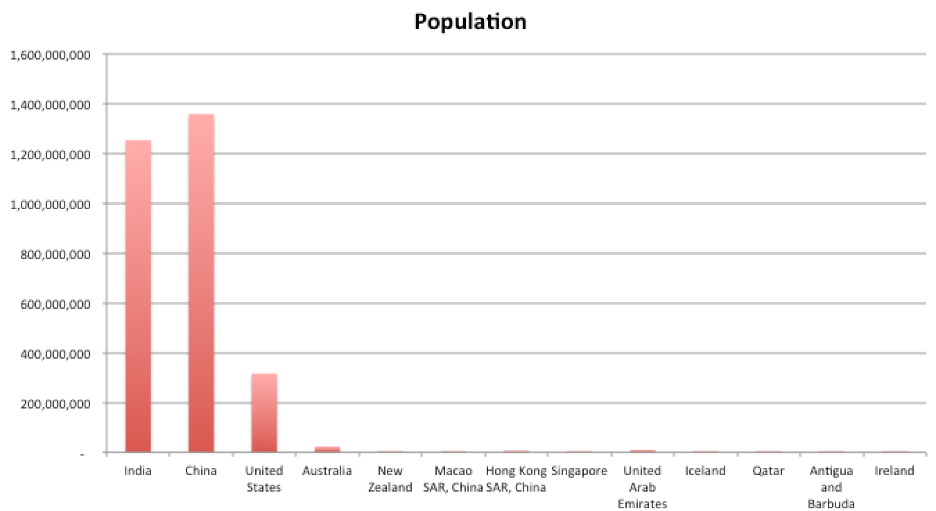
This chart uses that World Bank data to show domestic and international flights for the most flying-oriented countries, plus a few others for comparison. Nine countries score higher than Australia on this metric

Screen Shot 2015-02-04 at 2.09.39 pmWhen you look at the chart, it makes sense. The countries with the most flights per capita are islands. They are also often small countries where there’s nowhere else to go except to fly out. Several of them are tourist destinations or aviation hubs. (nb. Ireland and Antigua probably top the list because of their tax status (and RyanAir), not their proclivity for flying. The Irish statistical office claims only 22 million international flights) .

The countries above may also top the flights per capita listing because they are small. Australia is more than double the size of any country above it on the list (UAE, home to Emirates airlines, has 9 million inhabitants.)Screen Shot 2015-02-04 at 2.08.55 pm

Given all this, I am prepared to say Australians probably fly more than citizens of any other nation.

(The data from our own statistical agencies show the World Bank figures may underestimate the amount of flying. According to BITRE, Australia has 57 million domestic passengers a year and 23 million people, making 2.5 domestic flights per capita per year. Add in 33 million international passenger movements and the data suggest more than three flights per person per year – closer to 3.5. New Zealand may also be a contender for the flying-est nation, but its numbers are swollen by high inbound tourism, while Australia sees more departures than arrivals and a higher share of domestic travel.)

So Australians probably fly the most! We head to the airport as often as every three months. Woo-hoo?

I didn’t think so.

Meanwhile, at the other end of the scale, Indian nationals rack up on average one flight every 20 years. That’s less than Kenyans, but slightly more than the Cambodians.

What would happen if Indians started flying more? Such a densely populated country will probably never fly as much as Aussies do, but what if they flew at the same rate as the Americans, 2.35 trips a year?

That would mean another 3 billion people taking to the sky every year. That’s a doubling of current global passenger numbers, which, according to ICAO, topped 3 billion for the first time in 2012.

It’s safe to say this would be bad for carbon emissions. The contribution of aviation would jump from 2 per cent of the global total to more like 4 per cent. Sorry, penguins. Sorry polar bears.

Furthermore, I estimate the world would need an extra 8,000 planes. (Based on a generous 370,000 passengers per plane per year). For context, Airbus currently makes around 50 planes a month.

The conseuquences for the aviation fuel market could be significant. There are already problems with supply leading to rationing.

Those extra planes are going to need somewhere to land as well. What cities in the world have space for more runways?

China has already increased its appetite for flying tenfold. From 35 million flights a year in 1994, it has increased to 350 million by 2014. The lesson is this – economic growth sends people to the airports, for business and for leisure.

India’s economy grew at 5 per cent per year. At that rate it won’t be a “rich” nation for perhaps a century. But in 2010 it grew at 10 per cent, and if –  like China –  its growth rate can be held high, then it can become very rich very fast.

If everybody in India can afford to fly – even the bikies – its worth asking the question of whether the world is ready for the consequences.

Are the interest rate cut and the foreign investment crackdown linked?

In 2014, the RBA was loath to cut interest rates. But in 2015 it came out swinging, beating their previous record by knocking the official cash rate to 2.25 per cent!

Did the big bank decide:

a) the downside of a housing bubble isn’t that bad; or

b) the economy is in such dire shape that we need an interest rate cut even if it inflates house prices into a giant puffy monster; or

Screen Shot 2015-02-03 at 5.59.25 pm

c) the risks of a housing bubble can be contained?

Now, option a) seems unlikely. The US housing crisis is still very fresh in the minds of the globe’s central bankers. Just last year the Governor was warning in – for him – very strong terms about the risks flowing from housing. 

Option b) is not the answer either. This excerpt from Tuesday’s decision is not penned by an RBA frothing with fear:

“Overall, the Bank’s assessment is that output growth will probably remain a little below trend for somewhat longer, and the rate of unemployment peak a little higher, than earlier expected.”

So could option c) be the answer? They’ve found a way to contain housing risks?

It was only yesterday that Prime Minister Tony Abbott made a very public announcement about a crackdown on foreign investment in real estate.

“I am a friend of foreign investment but it has to come on our terms and for our benefit. The government will shortly put in place better scrutiny and reporting of foreign purchases of agricultural land and better enforcement of the rules against foreign purchases of existing homes so that young people are not priced out of the market.”

It was hard to process that announcement at the time, being bereft of context and detail. There had already been a crackdown announced. Was this new approach to have a louder crack, or push further down? It was a mystery.

Until the RBA rate cut.

I hadn’t though of a linkage here until I saw the question posed on Reddit. The person who asked the question in that forum sees causation running the other way, with an interest rate cut necessary to accommodate the deflationary effect of the crackdown.

But we know that the order in which things are revealed does not necessary accord with causation. Assuming so is to fall victim to the simplest kind of fallacy: post hoc ergo propter hoc.

The RBA may be betting that keeping Chinese money out of the market will help keep a lid on things.

Will that work? It might. Foreign investment represents only a tiny share of our market. But introductory economics textbooks tell you, economists think at the margin. A few extra bidders for a house can be what pushes the price of that house through the roof.

Think about it like this: if there 100 seat in lifeboats and the ship is sinking, the price of lifeboats will be zero if there are 99 passengers, and start to rise very rapidly if there are 101. The marginal bidder is important.

But that’s just the theory. The reality is that foreign buyers are scooping up very little real estate indeed.

which country bought most value held gorwing faster than value sold

pie chart

The RBA faces a market where investors are doing a lot of the lifting. They accounted for around 40 per cent of buyers late last year, a record. This interest rate cut could see auctions turn into a frenzy.