The concentration of men and women in various parts of Victoria is stronger than you’d expect according to random variation.
There’s some real trends in place that seem like a genuine puzzle. (These charts are made from fascinating data released by the ABS this week.)
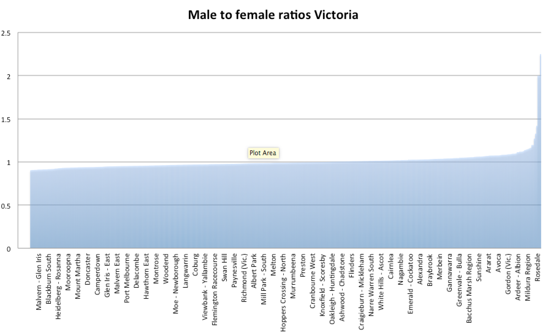 Fully a third of postcodes have a gender ratio that’s skewed more than 5 per cent one way or the other. There are slightly more postcodes where women outnumber men by 5 per cent (79) than those where men outnumber women by 5 per cent (62.)
That’s to be expected because there are 99 men per 100 women in Australia.
But where men outnumber women they do so by a lot more.
The top result is Port Melbourne Industrial, which is a place I’m surprised anyone calls home. And indeed there are just 9 males to 4 females (ratio 2.25). Security guards who sleep among the containers? Who knows.
The next one is Braeside. A similar story with a ratio of 12 men to 6 women. Then Alps East with 18 and 9. I’d like to imagine those 18 men have swags and wake each day to see their horse breathing steam under an old ghost gum.
Anyway, we can discount those three because the samples are tiny.

Rosedale is the real thing. 2645 men to 1863 women (ratio 1.42). A little hamlet out in the Latrobe Valley, it is probably full of people working in the coal-fired electricity industry. A hard place for a fella to get a date, no doubt. Although the photos on the Rosedale Tavern’s facebook page suggest that’s where the local ladies go. (and it’s not as bad as East Pilbara where men outnumber women 350 per 100.)
It’s easy to explain some locations of high concentrations of men by reference to workforce pressures. They are found around heavy industries and agriculture.
Some are more tricky. Why is Footscray so full of testosterone? Why Docklands?
And why do women crowd into the expensive eastern suburbs? We see Burwood, Camberwell and Armadale in the top 10 with less than 90 men per 100 women.
Toorak, the suburb most emblematic of wealth, has a ratio of 91 men to every 100 women. Are there many young single women there perhaps? Or families whose daughters live with them for a long time?
The CBD , meanwhile, has a ratio of 107 men to every 100 women.
Perhaps we are seeing women self-select into suburbs they deem are very safe, while men are more willing to live in supposedly rough areas?
Do you have another explanation? Please feel free to share it in a comment below!
EDIT
Commenter Matt points out that women live longer, which is a very good point (that I wish I thought of). This is definitely part of the explanation as we can see in the graph for the most skewed suburb, Burwood:
 But it’s not the whole explanation. If it were, Footscray would look similar up til the mid-40s, when men start dropping off. Instead Footscray has more men at every age.
 I think the puzzle has had a lot of pieces added, but there’s still some blank spots… Any further ideas?